SellPro Brand Guidelines for Retail Partners
The official style guide on how to use the SellPro logo, brand colors and fonts.
You can download the SellPro brand assets and style guide here.
THE SELLPRO LOGO
There are two main variations of the SellPro logo - the Circle, and the Full Logo.
The logo is available both with and without the "Learn. Earn. Sell." tagline. You may use whichever version is most appropriate for your application. (For example: if using the logo in print or publication where readability is not an issue, use the tagline version. However, if using the logo at a very small scale, like an icon, you may opt to use the logo without the tagline.)
Never alter the shape, color, arrangement, proportions or transparency of any part of the SellPro logos.
Never display the SellPro logo without the registered trademark symbol (®).
SellPro Circle

 |
.png) |
|
|
 |

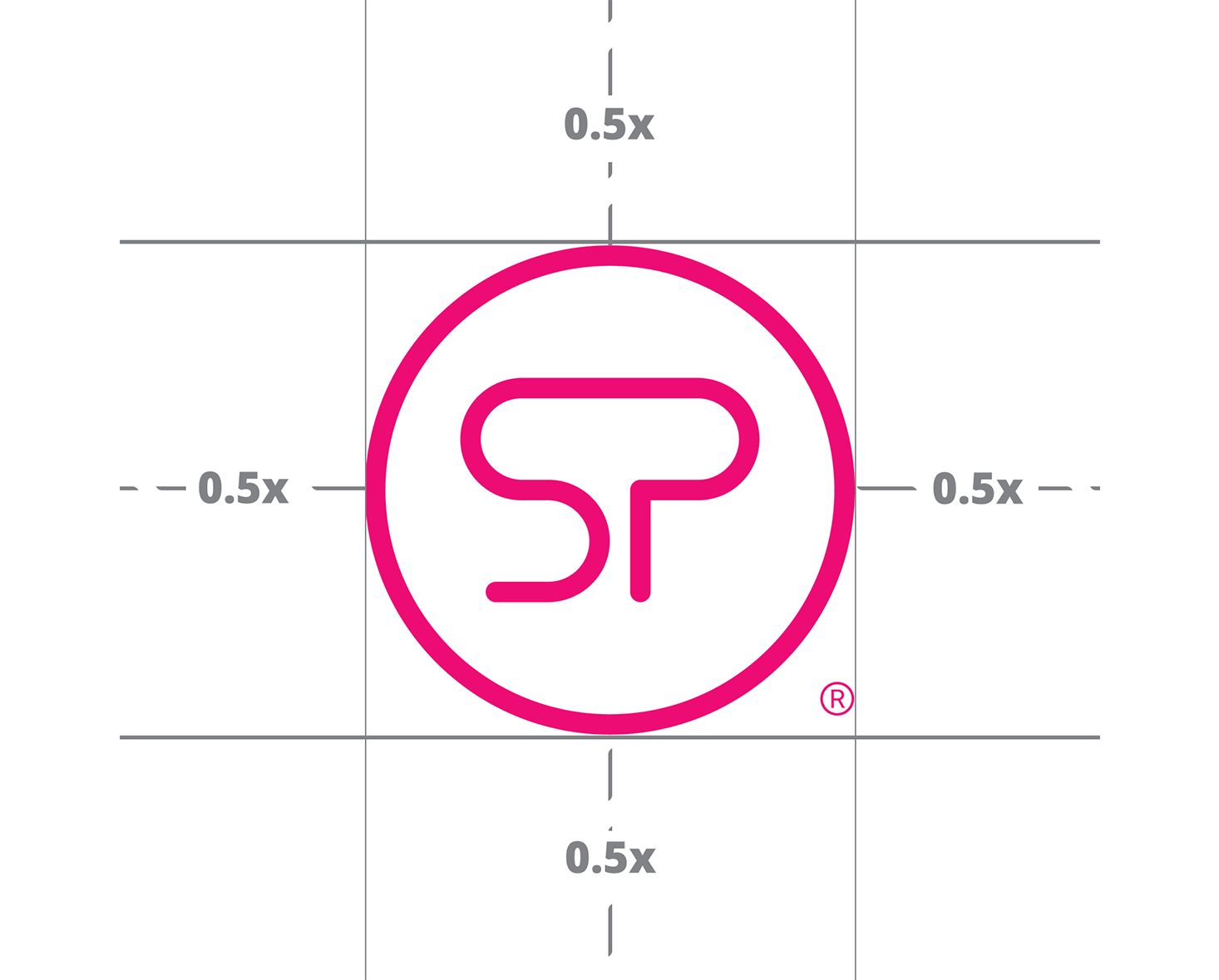
LOGO CLEARANCE
When incorporating the SellPro logo into your collateral, always allow a minimum clearance of half the width ("0.5x") of the SellPro Circle all around the logo.
 |
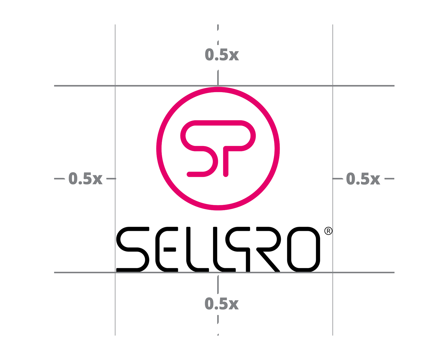 |
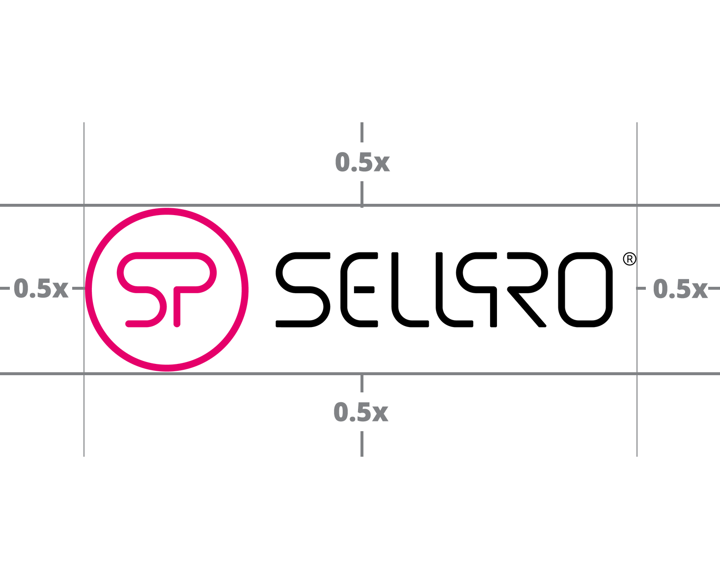
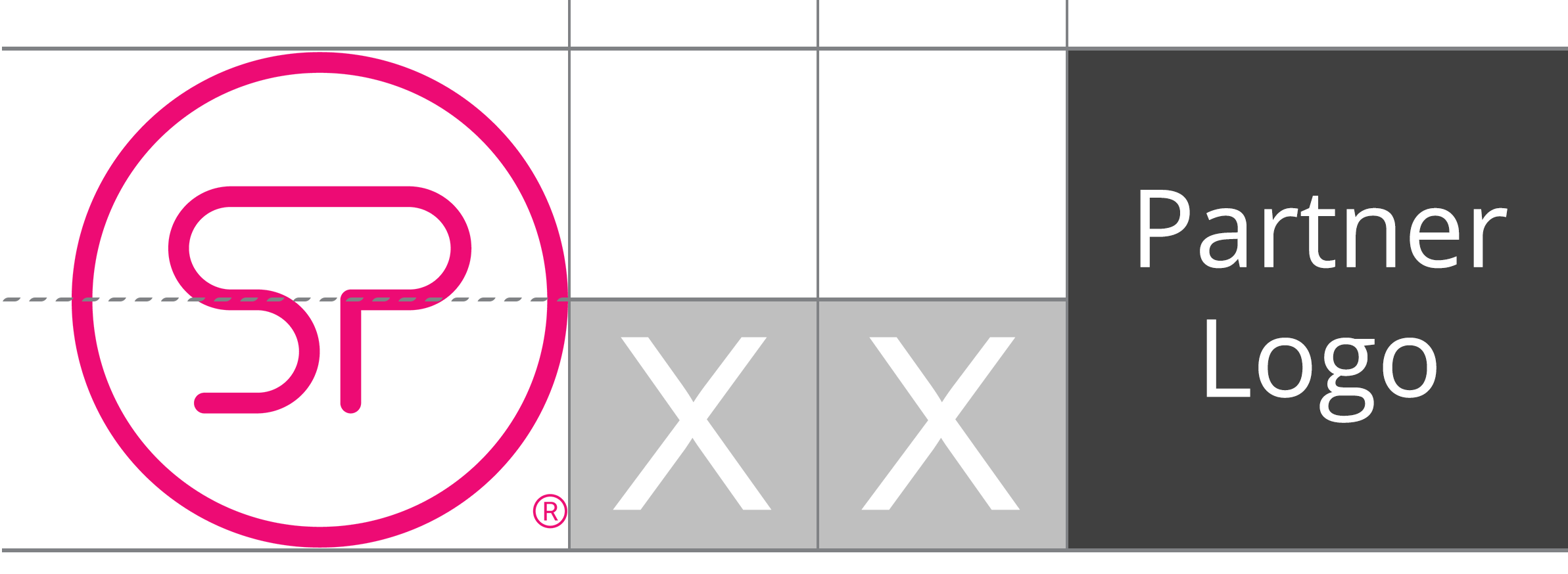
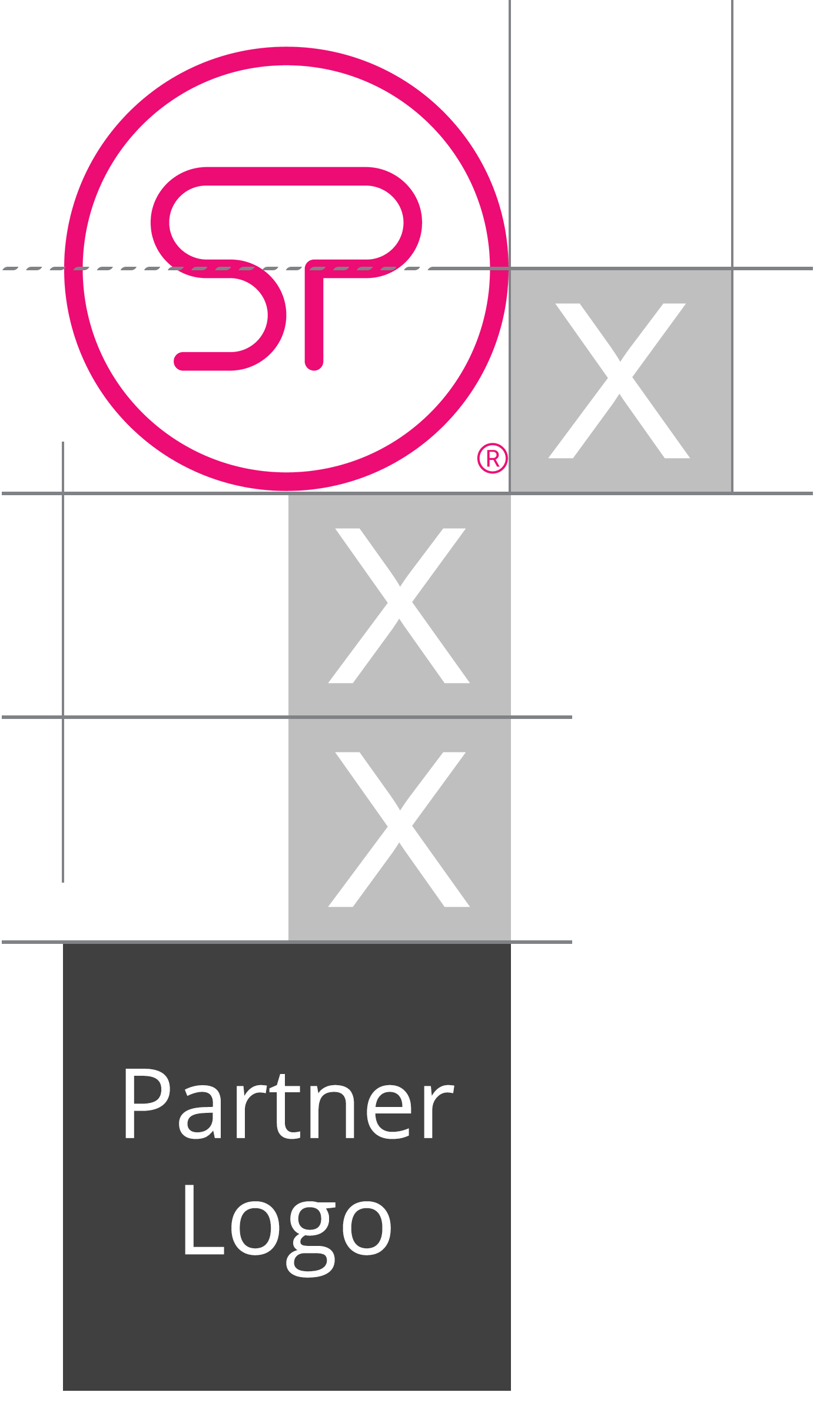
LOGO CO-BRANDING
When partnering with the SellPro logo, please allow double the required space around the SellPro logo ("X" = half the height of the SellPro Circle).
Partner logos must be the same height as the SellPro logo when placed side-by-side, and the same width when stacked top-to-bottom.
|
 |
LOGO COLORS
SellPro’s primary magenta color should be used in all cases except where one of the other acceptable color variations are more appropriate. The SellPro logo must be displayed over black, white, or solid colors that do not impact the visibility of the logo.
|
|
|
|


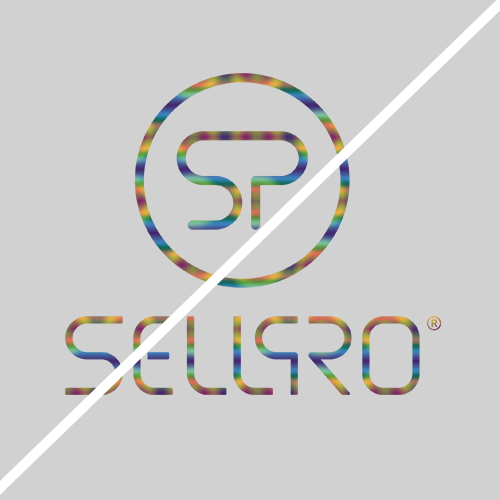
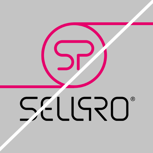
LOGO DON'TS
When using the SellPro logo, it is important that you strictly abide by the following:
|
|
 |
 |
| DO NOT alter the logo transparency. |
DO NOT add any effects to the logo (glows, shadows, etc.). |
DO NOT display the logo in low contrast environments. |
 |
 |
 |
| DO NOT separate the wordmark from the circle. | DO NOT skew or distort the logo. | DO NOT display the logo without the registered trademark (®). |
 |
 |
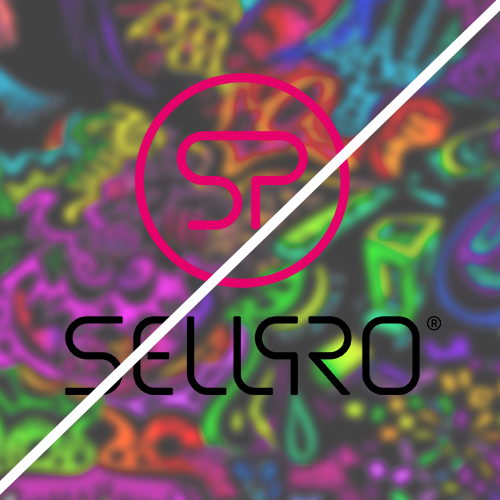 |
| DO NOT apply patterns or textures to the logo. | DO NOT incorporate the logo into another design. | DO NOT display the logo over busy backgrounds. |
TYPOGRAPHY
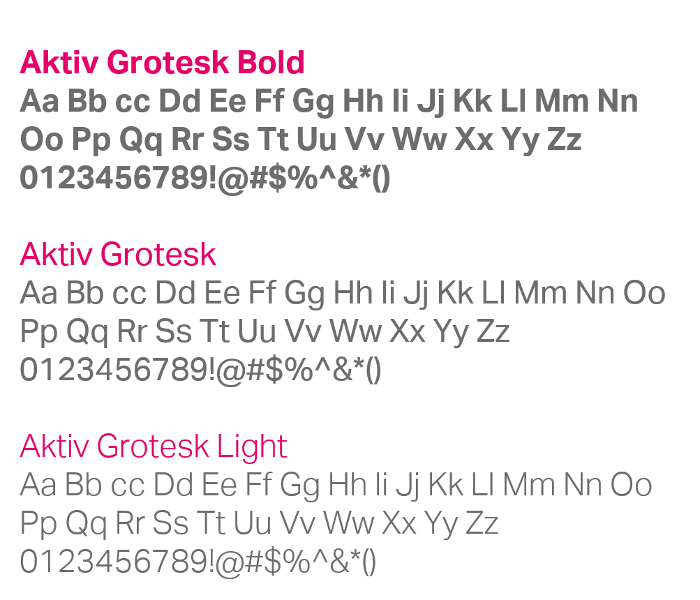
AKTIV GROTESK is the primary font used in SellPro marketing and collateral. The various font weights are to be used as follows:
- Headers and Subheaders – Aktiv Grotesk Bold
- Body copy – Aktiv Grotesk
- Subtext, captions, disclaimers – Aktiv Grotesk Light
ICONOGRAPHY
The icons below are used throughout the SellPro app to identify specific features, and should be used when representing these features visually.
To download icons in all brand colors, please see the ASSETS FOR DOWNLOAD section below.

ASSETS FOR DOWNLOAD
Below are the links to SellPro's brand guideline deck, logo files, sized and color-profiled for both print and digital use.
SELLPRO BRAND GUIDE FOR RETAIL PARTNERS
SELLPRO LOGO
- Logo Files, Adobe Illustrator (.ZIP, 22 MB)
- Logo Files, Encapsulated Post Script (.ZIP, 15 MB)
- Logo Files, Portable Graphics Format (.ZIP, 3 MB)
SELLPRO ICONS
Was this article helpful?